
Resource Data Storytelling
By Graduate Student Center
Your data tells a story! Make sure your data is telling the story you want to your audience with these tips from Penn Libraries!
Basic Elements When Designing Your Graphic
-
Title – general idea of graphic
-
Subtitle – more info on what the graphic is about
-
Chart - a graph or diagram
-
Data table – sometimes (not always a great visual)
-
Typography - fonts
-
Color - fonts, graphics
-
Labels - data you want to stand out
-
Dark/light contrast - IMPORTANT FOR ACCESSIBILITY
-
Annotations
Pro-tips on Colors in your graphics
-
White background is easier to read
-
Use black type for font on a light background
-
Use high contrast between colors - to test your color choices, convert to gray-scale or use a color-blindness simulator
-
Label directly on the chart
-
HSV attributes - usually good practice to use pre-selected color palettes
-
Hue - color
-
Saturation – how bright or vibrant it is
-
Value – opacity
-
-
Color Schemes
-
Qualitative data – different color values
-
Sequential data – fading from darkest to lightest color value
-
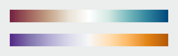
Diverging data – Two colors on ends that fade to white in the middle
-
Pro-tips on Fonts
-
Title should be 2 points larger than text
-
Avoid all caps
-
Bold or italic not both
-
Don't use stylized fonts
-
Avoid too small or condensed fonts
-
Don't turn text
-
Protip: reduce chart size and if you can still read it
Protip: Remove to improve – Excel defaults are often too much. Want a high data-to-ink ratio (lots of data for little ink)
www.data-to-viz.com - flow chart to help you choose a design
Data Storytelling – highlight specific elements using hue and saturation to emphasize a takeaway – still show all the data but highlight what you want the audience to focus on.
Protip: donut charts are better than pi charts
Vector graphics vs rastor (bitmap)
-
Jpg – good for photos not illustrations
-
Png – good for illustrations
-
Gif – good for illustrations
-
Bmp/tiff - just wrapped raw data, good for printing
-
Svg – best with illustrations but when ready to do something have to output in rastor
-
DPI – dot per inch
-
150 for web
-
300 for print
-
Some require 600
Data Visualization Tools
-
Excel – good if you change defaults
-
Highcharts, Tableau – specialized
-
Adobe Illustrator – expensive, free through Library, can edit plots from R or Python if output as an .svg
-
Inkscape – like Adobe but open-source
-
DataWrapper – online

